Systems | Development | Analytics | API | Testing

Design

Analytics best practice: 5 key dashboard design principles

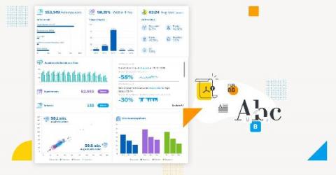
Simply put, a lot of effort is going into creating dashboards that the intended audience don’t even look at. The main purpose of a dashboard is to communicate business data in a visual form that highlights to the reader what is important, arranges it for clarity and leads them through a sequence that tells the story best so they can make better data-led decisions. Design and an understanding of how humans make decisions exist to assist this purpose.

How to Design a Scalable Rate Limiting Algorithm

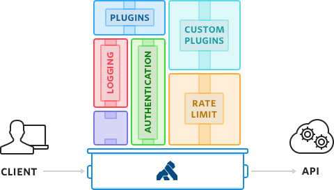
Rate limiting protects your APIs from inadvertent or malicious overuse by limiting how often each user can call the API. Without rate limiting, each user may make a request as often as they like, leading to “spikes” of requests that starve other consumers. Once enabled, rate limiting can only perform a fixed number of requests per second. A rate limiting algorithm helps automate the process. In the example chart, you can see how rate limiting blocks requests over time.

Testing for intuitive design

Apps are essentially technology products—products that aim to solve a problem for users. Design is a salient feature in all apps; it is how users understand, interact, and use a product. The less intuitive an app is in terms of design, the harder it is for its target audience to learn to use it. Poor design ultimately costs products their user-base. No one will return to an app that is hard to use, nor recommend an app that is difficult to understand and learn.