Systems | Development | Analytics | API | Testing

Qlik

Insight With Eyesight: Qlik Introduces a New Era of Visualization

Our ability to tell stories is an art form as old as language itself. From ancient cave paintings to oral traditions passed through generations, the essence of stories has evolved alongside our communication methods. It began with visual tales etched on cave walls, transitioned into spoken narratives, and eventually found its way into written, printed, and typed forms.

SaaS in 60 - Cyclic Group Dimensions

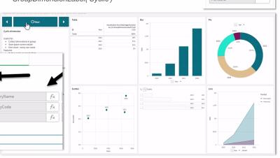
This week a new Dimension type for Master Item Dimensions is available, Cyclic groups. You all know that Master Items offer a centralized, reusable governed library of measures, expressions, visualizations and both single and drillable dimensions – now with Cyclic group defined dimensions – you can dynamically cycle through dimensions in every chart, at the same time using a click of a button or simple selection. Offering new ways to analyze data, save precious screen space and enable multiple use cases on a single chart.

How to Create a Collapsible Filter Panel - Do More with Qlik

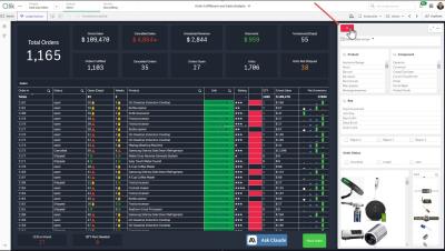
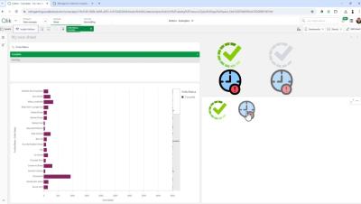
In my last blog / video. I showed you how to easily create visual buttons to apply selections and change their visual selection state so they can appear enabled or disabled (selected, not-selected). In this video I'll show you how to setup a filter panel using buttons and the layout container to create a simple collapsible filter panel that is both esthetic and functional while also providing real estate for your dashboard objects.

Introducing Qlik's AI Accelerator - Delivering Tangible Customer Outcomes in Generative AI Integration

At Qlik, we're witnessing a thrilling shift in the landscape of data analysis, customer engagement, and decision-making processes, all thanks to the advent of generative AI, especially Large Language Models (LLMs). The potential for transformation across all sectors is enormous, but the journey toward integration can be daunting for many businesses with many leaders wondering where to start in integrating the exciting capabilities of AI into their daily workflows.

How to Create Visual Button Selection States - Do More with Qlik

Ever wonder how those Qlik experts make those awesome interactive dashboards? It is easier than you think. Check out this video that quickly shows you how to create custom beautiful buttons to apply selections and visually represent an active or non-active selection state. Allowing users just another way to analyze data in a way that is easy and familiar.

The Sliding Doors for Responsible AI

In this blog series, I have been exploring the “sliding doors” – or divergent paths - organizations can take with data and analytics. Sometimes, grabbing the wrong door means missing out on creating the most value with your data. But in some instances, it can also lead you on a more serious path of breach of compliance with regulations.

7 Easy Steps to Accelerate SAP Data Replication in Real-Time in Databricks

Data engineers play a crucial role in leveraging the immense potential of SAP data to drive smarter decisions and foster innovation. However, integrating and analyzing this valuable information can be complex and time-consuming. But it doesn’t need to be. In this blog post, we will explore how Qlik Cloud Data Integration and Databricks together make it much easier to harness the power of SAP data and blend that data in Databricks, in a cost-effective manner.

Tabular Reporting for NPrinting Users - Do More with Qlik

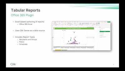
Join Michael Tarallo, along with special guests Product Manager Andrew Kruger and Principal Platform Architect Johnny Poole, for part 2 of Qlik Tabular Reporting. In this session, the focus shifts to the migration path for NPrinting users, exploring available utilities, migration paths and best practices for a seamless transition.