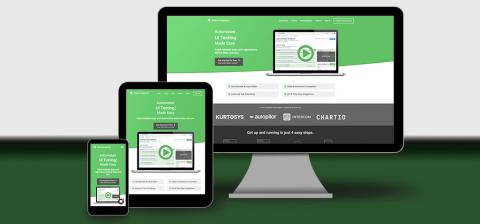
Testing your responsive design using viewports
It's 2017 and "mobile first" isn't just that thing that's "nice to have" any more. It's become expected that you're going to provide a consistent experience to your end users whether they're hitting your site on their desktop, phone, heck even their watch! It's pretty clear by now that this "mobile trend" isn't going away any time soon, in fact the numbers show that the vast majority of users are reaching to multiple devices (phone, tablet, and desktop) to interact with your site.


