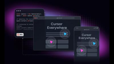
In today’s data-driven world, presenting data in a visually compelling manner is paramount for user engagement and clarity. React, a premier library for building UIs, has an extensive UI component ecosystem which offers many options for integrating charts. From business analytics dashboards to scientific data displays, the right charting library can transform numbers into insightful narratives.
We are very excited to announce a new product — Spaces! The Spaces SDK comes with an intuitive set of APIs that allow you to build realtime collaboration features such as avatar stacks, live cursors, member location and component locking, in days. Each API is optimized for their specific use-case, reducing integration effort.
Category Visionaries is a podcast where founders and CEOs share their stories from the front line of business. It specializes in discussions with leaders who are disrupting and reimagining the business model of their industry. Our CEO Matthew O’Riordan recently sat down with the podcast’s host, Brett Stapper, to discuss his journey since founding Ably, the reasons he did so, and the decisions he’s made along the way. Here’s the full discussion.
According to research from Matillon and IDG, data volumes increase by 63 percent per month on average in an organization. Examining such substantial volumes of data without the right tools makes it impossible to make informed decisions, even in small businesses. The key to deriving useful and profit-driving insights from data is data visualization - which turns complex raw figures into meaningful visual representations of the data. Google Charts is a free data visualization library provided by Google.
Near real-time notifications have become a regular feature in modern applications. These notifications inform us about taxi arrivals, food deliveries, prescription availability, etc. Incorporating this experience into modern enterprise applications is crucial to offer users a smooth, simple, and secure experience.
When was the last time you WhatsApped someone? In all likelihood, the answer is probably not that long ago. First released in 2009, WhatsApp quickly became the default setting for instant messaging in much of the world. By 2014, it defined the market so much that it was acquired by Facebook – and it has pretty much remained a leader in the chat space ever since.
One of the common methods that businesses and organizations use to make sense of their complex and scattered data is data visualization. Data visualizations provide a quick way to understand the masses of data collected - - providing easy access to insights needed to drive growth. A dashboard is a data visualization tool that is commonly found in enterprise web applications.
Working with collaboration tools like Miro and VS Code Live Share has transformed my expectations of collaborative interactions. However, I found myself trying to move my cursor around websites during calls with colleagues, despite not sharing my screen. It was as if I believed they could see my cursor. I even caught myself saying, 'and when I click here...', only to realize I was sharing with nothing but the void. I decided to do something about this with a project I'm calling 'Cursors Everywhere'.