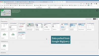
Qlik Sense SaaS in 60 - Active Grid and Chart Dimensions
Learn what's new in Qlik Sense SaaS: - Active chart and grid dimensions.


I’ve been a Business Intelligence (BI) analyst and evangelist for over two decades now. As you can imagine I’ve worked with many different BI platforms throughout my career, especially during my time as a BI Consultant. In this role, I was product agnostic, so from Power BI to Tableau, you name it, I used it! However, Qlik Sense quickly stood out to me as the most powerful and intuitive platform on the market.
I’ve met with lots of customers and prospects throughout my career. And, I’ve noticed that, when I’ve asked them to describe their current software situation, many would say the same things. “We should have updated this a long time ago.” “It’s embarrassing how long it takes to do a simple task.” “I bet other companies stopped doing things like this years ago.”
Part of being a data professional is pretty simple... you notice when things don't add up. In my case, my Apple Watch and my Peloton aren't on the same data page when it comes to calorie tracking. In this blog, I'm going to deduce why I think it's happening and use Qlik and the Peloton/Apple metrics as the data to support my conclusions.
In what feels like a lifetime ago now, way back in 2012, the Harvard Business Review called out the role of data scientist as the sexiest job of the 21st century. Almost a decade later, does that still ring true?
The new 2021 Gartner Magic Quadrant for BI and Analytics report is out, and you can find it here! Gartner’s brand, alongside its breadth of research by its analysts, ensures that it’s a key reference document for clients in buying situations. No wonder, then, that every year the industry anxiously awaits where dots will fall on that famous 2x2 matrix. Therefore, I’m delighted to announce that Qlik is a Leader, again, for the 11th year in a row.
Every new decade sees businesses split into winners and losers as technology evolves, competitiveness tightens, and new market entrants challenge the incumbents.