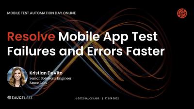
Systems | Development | Analytics | API | Testing

Editing and saving a dashboard

In this video you will learn how to edit one of your existing Yellowfin dashboards — such as adding a new report to a dashboard and then save those edits by publishing the dashboard. You will also learn how to edit/change the title of the dashboard, select/change the folders where the dashboard will be saved, and how to add tags to your dashboard. You will also learn how to edit/change the Dashboard Access to either Public or Private.

Enterprise data and analytics in the cloud with Microsoft Azure and Talend

The emergence of the cloud as a cost-effective solution to delivering compute power has caused a paradigm shift in how we approach designing, building, and delivering analytics to business users. Although forklifting an existing analytics environment into the cloud is possible, there’s substantial benefit for those that are willing to review and adjust their systems to capitalize on the strengths of the cloud.

[DEMO] How to manage Talend Studio updates from Talend Management Console?

Talend Cloud provides powerful graphical tools and 900+ connectors and components to connect databases, big data sources, on-premises, and cloud applications. Design cloud-to-cloud and hybrid integration workflows in Talend Studio and publish them to a fully managed cloud platform. If you are using Talend Cloud Management Console with Talend Studio, depending on your license, you can create executable tasks for Jobs, Data Services, and Routes published from Talend Studio and run them directly in the cloud or on Remote Engines, ensuring the security of your data. =

Cloudera DataFlow Functions for Public Cloud powered by Apache NiFi

Since its initial release in 2021, Cloudera DataFlow for Public Cloud (CDF-PC) has been helping customers solve their data distribution use cases that need high throughput and low latency requiring always-running clusters. CDF-PC’s DataFlow Deployments provides a cloud-native runtime to run your Apache NiFi flows through auto scaling Kubernetes clusters as well as centralized monitoring and alerting and improved SDLC for developers.

How to add multiple charts to a report

In this video you will learn how to add multiple charts, or visualizations, to a single data table as you build a report. You'll learn about using the Auto Chart feature, as well as manually selecting your own chart types. In addition to adding charts, you will learn how to add text, graphics, and images to your report. Once you are finished adding charts and other visual elements, you will learn how to properly save your multi-chart report.