
Systems | Development | Analytics | API | Testing

Top 10 Essential Types of Data Visualization of 2025: From Basic to Advanced

Data visualization helps people comprehend and attain insight into big data. It represents complex data in visually interesting ways that assist in our understanding, and paves the way for a greater link between the provided raw data, and our overall engagement with it. Nowadays, we accumulate data in ever-increasing sizes. We need an intelligent way to understand vast volumes of information. In analytics, we often use different types of data visualization tools to convey complex data.

How Visual Dashboards Empower Safe and Simple Database Updates

Managing databases doesn't have to be complex. Visual dashboards simplify database updates, making them safer and easier, even for non-technical users. Powered by tools like DreamFactory APIs, these dashboards provide secure, user-friendly interfaces for tasks like updating records, managing schemas, and exploring data - all without direct database access.

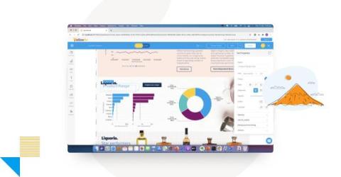
How to Display Charts on a Dashboard Like a Catalog

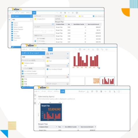
Yellowfin provide extensive customization for the design of dashboard content so you can achieve the exact look and feel required for your unique business audience and use case. Out-of-the-box, our drag-and-drop design canvas (Yellowfin Canvas) and low-code, no-code user interface enables non-developers to easily access many handy features. However, sometimes, you may want to extend Yellowfin further, or control the design and layout of your dashboard in a more specific way.

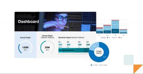
How to Create a Dashboard in Yellowfin: Step-by-Step Guide

Welcome to the final entry in Yellowfin Japan’s long-running ‘How to?’ blog series! This series of blogs has aimed to to provide your team with a step-by-step guide of how to create your own Yellowfin dashboard, starting from the design and data transformation flow, all the way to creating rich data visualizations and using the right report filters.

How To Create A Grafana Dashboard For Keploy: Easy Step-By-Step Guide

In today’s fast-paced development environment, efficient monitoring and visualization of test results are essential for ensuring the quality of your application. Keploy, a zero-code testing tool, simplifies test generation and integration, but how do you effectively monitor and analyze the test data Keploy generates? This is where Grafana, a powerful open-source analytics and monitoring platform, comes into play.

How to Drill Through in Yellowfin Dashboards

Welcome to the latest entry in Yellowfin Japan’s ‘How to?’ blog series! This series of blogs aims to provide your team with another hands-on example of adding data visualization to your Yellowfin dashboards, using our array of chart and graph types. In the previous blog, we created a Combination Chart by aggregating on the basis of Year and Month.

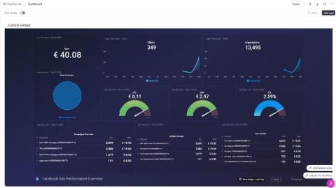
How to Embed Databox Dashboards in ClickUp: A Step-by-Step Guide

Imagine having all your critical business metrics and project data seamlessly integrated within your favorite project management tool. For ClickUp users, this vision becomes a reality with the embedding of Databox dashboards. No more toggling between multiple platforms or juggling tools — embedding a Databox dashboard into ClickUp centralizes your insights, empowering you to make informed decisions without missing a beat.