The Current State of Data and Analytics and COVID
The pandemic has created monumental shifts in daily life, making all of us re-evaluate almost every aspect of our work and home lives.
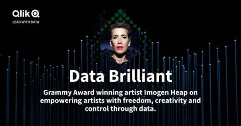
This was one of the key takeaways from student Noah Bledsoe in the latest episode of the Data Brilliant – Unplugged series, which explored how Radford University is arming its students with data skills to prepare them for the future world of work.
Have you ever felt that, by looking at just numbers, that you are probably missing out on the bigger picture? That’s, of course, why we have visualizations – to form patterns out of those numbers that we can then interpret, as well as glean insights from and deepen our understanding of what the data reveals. Now, what if we bring numbers and visualizations together in a table, one way to explore those numbers and find hidden gems of meaning? Let’s have a look at mini charts!
Today, we announced the acquisition of the assets and IP of Knarr Analytics, an innovative start-up that provides real-time collaboration, sophisticated data exploration and insight capture capabilities, to complement Qlik’s cloud data and analytics platform.
Back in 1977, an English mod/rock band called The Jam released a track called “The Modern World.” The same year also saw the dawn of the home computer, with the Apple II and Commodore PET 2001 going on sale at a time when the mainframe was going strong. Fast forward to 2020, and, despite many false claims of its death, the mainframe remains strong; however, to get the most value of from the data inside, mainframe modernization is key.
There is no debate. Making sense of your data is just good business. Studies from Forrester Research, McKinsey and more show that companies that leverage their data better tend to outperform their less-informed counterparts. Our own recent research, Data as the New Water: The Importance of Investing in Data and Analytics Pipelines, done in partnership with IDC, shows that companies that optimize their data pipelines see enhanced operational efficiency (88 percent vs.
Earlier this year, we launched a unique partnership with Fortune Magazine, with the first-ever data analytics site supporting the publication of the annual Fortune 500 list. Today, we extended that partnership with the debut of the “History of the Fortune Global 500,” our interactive data analytics site timed with the publication of the 30th anniversary of the Fortune Global 500 list.