Systems | Development | Analytics | API | Testing
Create an Excel Dashboard from Scratch in 8 Steps (or Just 3 with Databox)
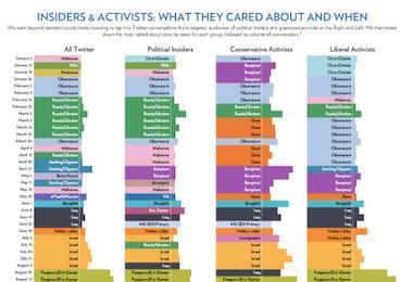
The Best Data Visualization Examples
Data visualization is the art of representing complex data sets in a visually appealing way. It can help your reader better understand what they're looking at, and it's an ideal way to make sense of large or confusing sets of data. For example, imagine reading a report about a study that involved tracking participants' sleep patterns for three months.
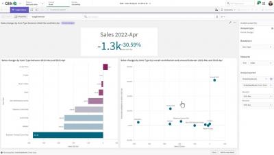
Quick Qlik - Insight Advisor Analysis Types - Smart Sheet: Period Changes
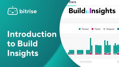
Introduction Build Insights
What's an E-Commerce Dashboard? & Why Does it Matter?
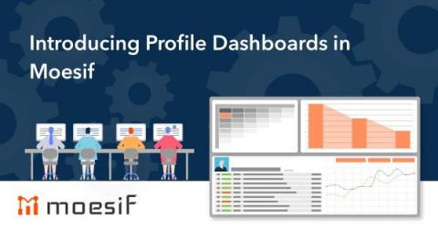
Introducing Profile Dashboards in Moesif
We are excited to announce that Profile Dashboards are now live within Moesif! We have designed Profile Dashboards to enable customer-facing teams with a convenient way to monitor and analyze your customer’s account health. This new feature provides customer specific information in an easy and consistent fashion. Profile Dashboards allow you to see a personalized dashboard for specific users and companies.
The Usability of Dashboards (Part 1): Does Anyone Actually Use These Things?
Dashboards showing ever-increasing levels of information are more and more in demand, but perhaps less and less understood. In particular, application teams selling products are pushed by their customers to include “high-level overviews” and “real-time information” in their software. But do they use that information? How often? And what for? Sometimes a dashboard is a critical piece of software enabling near-instantaneous responses to extinction-level business catastrophes.


