Fine-Grained Authorization with Apache Kudu and Apache Ranger
When Kudu was first introduced as a part of CDH in 2017, it didn’t support any kind of authorization so only air-gapped and non-secure use cases were satisfied. Coarse-grained authorization was added along with authentication in CDH 5.11 (Kudu 1.3.0) which made it possible to restrict access only to Apache Impala where Apache Sentry policies could be applied, enabling a lot more use cases.
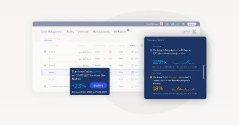
How to accelerate digital transformation with Automated Business Monitoring
With automation becoming more user-friendly and streamlined than ever before, it's understandable organizations across sectors are examining how it can enhance their analytics capability and accelerate their business shift toward digital transformation.
How to ace on premise to cloud migration in 2021
Categories vs. Tags - SEO Best Practices for Sorting your Content
11 Improvements to Databox Charts Are Now Live
How to trigger Cloud Run actions on BigQuery events
Many BigQuery users ask for database triggers—a way to run some procedural code in response to events on a particular BigQuery table, model, or dataset. Maybe you want to run an ELT job whenever a new table partition is created, or maybe you want to retrain your ML model whenever new rows are inserted into the table. In the general category of “Cloud gets easier”, this article will show how to quite simply and cleanly tie together BigQuery and Cloud Run.
Using Chartio with Xplenty Part 2: Visualizing the Data
In Part 1 we learned how to set up our Xplenty pipeline to work with Chartio and prepared the data source. In Part 2, we will focus on using the data Xplenty provides in the Chartio platform. If you're new to Chartio, you can read through their QuickStart docs (shouldn't take more than 5-10 minutes) to gain some familiarity.
How Emirates And Allianz Benelux Are Transforming Customer Service With The Data Cloud
Snowflake met with Jan Doumen, Head of Expertise for Allianz Benelux, and Naveed Memon, Program Director, Data and Analytics for Emirates, at Data Cloud Summit 2020. Read excerpts from the conversation to learn how capturing data insights in the Data Cloud brings value to their businesses. Data’s value in the 21st century is often compared to oil’s value in the 18th century. It can transform organizations, opening doors to unprecedented opportunities.


